
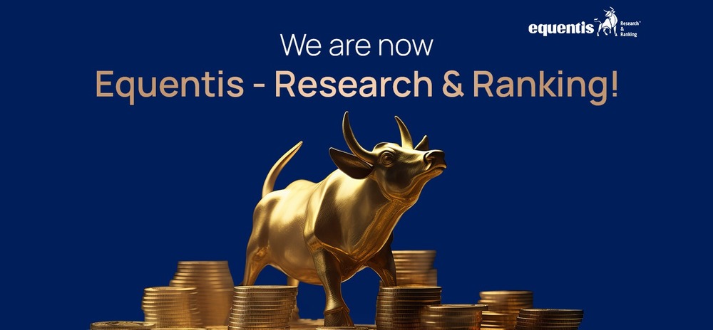
We are now Equentis!
You read it right: Research & Ranking is rebranding itself as Equentis – Research & Ranking.
We’re excited to share our fresh new look with you! Our rebranding reflects who we are and what we stand for, moving us towards democratizing wealth creation for all. Beginning on March 26th, ’24, the new branding will appear on the company’s advertising, website, social channels, and branch offices.
As our Founder and MD, Manish Goel, says, “We’ve been thinking about taking this bold step to rebrand ourselves for a long time. This change is very close to our hearts and minds. It is one of the many things we are doing as a part of our roadmap for accelerated growth. We believe our efforts to transform while embracing our incredible heritage will keep us relevant for generations.”
Our CMO, Alok Arya, says, “Bringing the mother brand, Equentis, which stands for Equal Existence, to the fore will help to create a cohesive narrative that flows effortlessly from the House of Equentis, ensuring consistency in messaging, design, and overall brand experience. We’ve come a long way since we began in 2009 and are thrilled to embrace new opportunities and challenges. Our values and mission have always been at the heart of everything we do!”
Of course, we understand you will have several questions. If you are wondering about the reasons for change, why now, and what’s changing, you are at the right place to know the answers you seek.
Why Did We Decide to Rebrand?
Financial success is vital to all of us, and we understand the importance of staying current with the ever-changing economic landscape. Research & Ranking, a known player in the Indian financial world, has evolved along with the market to serve you better. As part of our mission to help over a million families prosper, we are excited to announce the launch of our new and improved brand.
Over the past two years, the business has seen remarkable expansion, venturing into new territories with the addition of Private Wealth and Informed InvestoRR, catering to thousands of customers. With a vision to carve a niche and be recognized as a distinct category creator, Equentis decided it was time for a revamp.
The plan is to bring Equentis, our mother brand, to the forefront. We want to ensure that the story and message flow seamlessly throughout the House of Equentis so everyone can enjoy a consistent and enjoyable brand experience. As always, the brand’s primary goal is to help all Indians create wealth through equities, no matter where they come from.
Why The New Logo? What Is The Story Behind It?
Before we get to the formal reasons for the logo change, here is an interesting tidbit. Whenever we introduced the brand Research & Ranking to someone, the first thought that popped into their mind was – Is it a research company?
No, we are not a research company but a stock advisory company, which has always been our reply. So, when we decided to revamp, the change in logo was central to the plan. Now, with the new logo, explaining what we do will become a breeze.
The unveiling of Equentis’ new logo marks a significant milestone in our journey. Our new logo incorporates the mother brand Equentis, which stands for Equal Existence. The bull symbolizes the stock market, with Research & Ranking signifying the service/product descriptor. The logo highlights our commitment to equality internally and externally while maintaining our parent brand’s reputation. The mighty bull symbolizes equity investment, takes center stage, and represents our specialization in Equity Advisory.
Why Did We Choose The Bull As Our Symbol?
The obvious answer is what you are thinking. Yes, the Bull symbolizes the bull in the stock market. That makes explaining what we do in the investment space easy. But if you are wondering why the bull is looking up and is focused on Equentis. Have you ever seen the Bull? You will find his head down, horns forward. When the bull wants to dominate, it lowers its head to display its horns.

However, the bull in our logo stands tall with keen eyes focused on Equentis. The focus symbolizes the Sherpa, who rightly shepherds investors from all walks of life to their financial goals.

So, are you ready for the Sherpa to guide you?
Why Is The Logo In Lowercase?
Equentis’ choice of a lowercase font in the branding reflects our values. We believe in being humble, authentic, helpful, reassuring, and credible, and this typography plays a crucial role in reinforcing our identity as a modern fintech player that combines tradition with innovation. The sleek and contemporary design of the logo embodies our ethos of being forward-thinking yet grounded in expertise.
What Does The New Identity Convey?
The new identity positions Equentis as a trusted Sherpa in the financial landscape, guiding clients through the complexities of wealth creation with expertise and care. Think of Equentis as your nurturing force of nature, using its experience and insights to help you achieve financial prosperity.
We take a practical and objective approach to navigate the market precisely, helping you avoid potential pitfalls and achieve your wealth creation goals. With data-driven wisdom, we empower you to make informed decisions, ensuring a seamless journey toward financial success.
Why Did We Choose These Two Colors?

The choice of blue and gold for Equentis’ new identity is deliberate and symbolic. Blue, synonymous with trust and reliability, reflects Equentis’ commitment to transparency and integrity. Conversely, Gold represents wealth and prosperity, aligning with Equentis’ mission to help clients unlock their financial potential.
Why Did We Change Our Tagline? What Does It Convey?
Equentis recognized the need for clarity and simplicity in equity investing in a world driven by emotions and information overload.
The new tagline, “Making equity easy,” encapsulates Equentis’ commitment to cutting through the clutter and providing clients with clear, actionable insights. Equentis empowers clients to navigate the market confidently and easily by alleviating the fear and greed often associated with equity investment.
What Does This Change Mean to Your Subscription?

The product remains the same for now. Your login details and the benefits of every solution we offer remain the same. Remember, the logo, tagline, and identity may have changed, but our commitment to your progress is steadfast.
I’m Archana R. Chettiar, an experienced content creator with
an affinity for writing on personal finance and other financial content. I
love to write on equity investing, retirement, managing money, and more.