
Introduction
The stock market is dynamic, and understanding its tools is critical for success. Among these tools, stock charts are indispensable. They visually represent a stock’s price movement over time and provide essential insights for both investors and traders. Learning how to read stock market charts can help you identify trends, anticipate market movements, and make informed decisions.
Why Reading Stock Charts is Crucial for Investors and Traders
Stock charts are a cornerstone of technical analysis, helping investors and traders make sense of market data. By reading stock market charts, you can:
- Identify Trends: Understand whether a stock’s price is rising, falling, or stable.
- Spot Patterns: Recognize recurring formations that indicate potential price movements.
- Plan Entry and Exit Points: Decide when to buy or sell for optimal returns.
Understanding how to read stock market charts is essential for making well-informed decisions and staying ahead in a competitive market.
What Are Stock Market Charts?
Definition and Importance of Stock Charts for Investors
Stock charts represent a stock’s price, volume, and other metrics over a specified period. They are vital tools that:
- Illustrate historical performance.
- Highlight trading activity and market sentiment.
- Aid in predicting future price movements.
Types of Stock Charts Commonly Used in the Market
1. Line Charts
Line charts are one of the most straightforward and beginner-friendly tools in stock analysis. These charts depict overall price trends over a specific period by connecting data points with a single line. They help investors visualize a stock’s performance trajectory, making it easier to spot upward or downward trends. For instance, a steadily rising line suggests consistent growth, while a declining line indicates potential underperformance. These charts are handy for long-term trend analysis and understanding historical performance at a glance.
Beginners and long-term investors who want a clear and simple visualization of general price movements without unnecessary complexity.

2. Bar Charts
Bar charts provide a detailed view of a stock’s daily price fluctuations by representing the high, low, opening, and closing prices for a specific period through vertical bars. Each bar’s length reflects the price range during the interval, with horizontal ticks indicating the opening and closing prices. Longer bars suggest higher volatility, while shorter bars indicate relative stability. Traders often use bar charts to understand intraday movements and identify potential entry or exit points based on price activity. By analyzing the relationship between bars over time, investors can detect trends or reversals in market behavior.
Traders who require comprehensive insights into daily or intraday price ranges and wish to fine-tune their strategies based on precise market movements.
3. Candlestick Charts
Candlestick charts are a powerful and visually intuitive tool that combine the elements of bar charts with additional detail through color-coded candlesticks. Each candlestick represents a specific time frame and displays the opening, closing, high, and low prices. The “body” of the candlestick highlights the range between the opening and closing prices, while the “wicks” (or shadows) extend to show the highest and lowest traded prices within the period. Green or white candles typically indicate price increases, while red or black candles signal declines. Advanced traders rely on candlestick patterns, such as “doji,” “hammer,” or “engulfing,” to forecast market reversals or continuations, making these charts indispensable for short-term trading and trend analysis.
Advanced traders and technical analysts seeking to identify intricate patterns and trends for precise trading decisions.

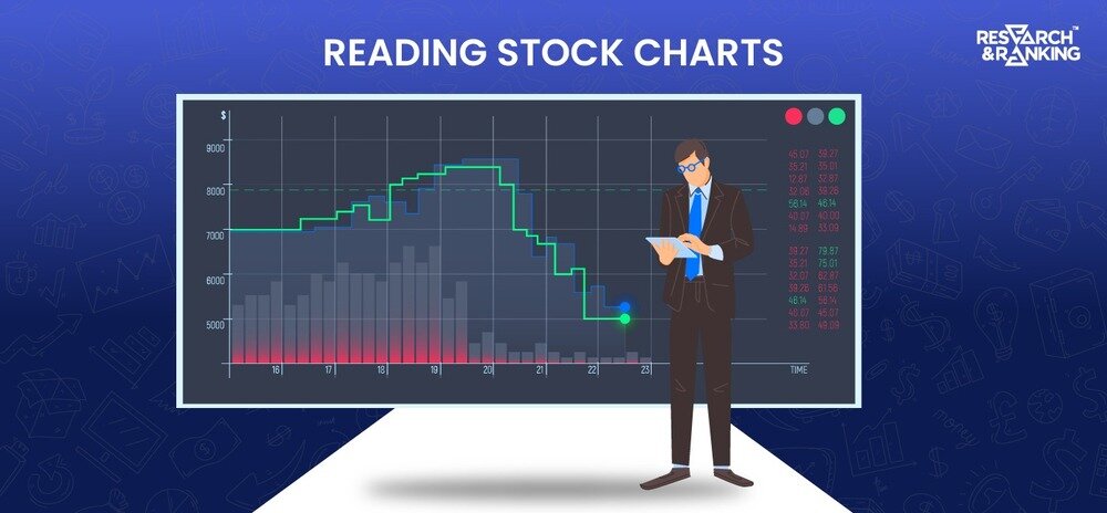
How to Read Stock Market Charts
1. Understanding Key Elements of Stock Charts
Price, Volume, and Timeframe
- Price: Tracks the stock’s value at different times, showing open, high, low, and close prices.
- Volume: Indicates the number of shares traded during a period, reflecting market activity and interest.
- Timeframe: Can range from minutes (for day trading) to years (for long-term investments).
Support and Resistance Levels
- Support: A price level where demand is strong enough to prevent further decline.
- Resistance: A price level where selling pressure is strong enough to cap further gains.
2. Identifying Stock Chart Indicators
Moving Averages (MA)
Moving averages are one of the most commonly used tools in technical analysis to identify and confirm market trends. They smooth out price data by creating a single flowing line, making it easier to interpret market direction. There are two primary types: the simple moving average (SMA), which calculates the average price over a set period, and the exponential moving average (EMA), which gives more weight to recent data for a more responsive trend line.
Common types: The 50-day moving average is widely used to analyze medium-term trends, while the 200-day moving average provides insights into long-term market trends. For example, when the 50-day MA crosses above the 200-day MA (known as a “golden cross”), it signals a bullish trend, while a “death cross” (50-day crossing below the 200-day) indicates bearish momentum.
Relative Strength Index (RSI)
The Relative Strength Index is a momentum oscillator that measures the speed and magnitude of a stock’s recent price movements. It helps traders identify overbought or oversold conditions in the market. The RSI is displayed as a line graph on a scale of 0 to 100, with key thresholds set at 70 and 30.
Values: When the RSI is above 70, the stock is considered overbought, meaning it might be due for a price correction. Conversely, an RSI below 30 suggests that the stock is oversold and could experience a rebound. For example, a stock with a rising RSI nearing 70 could be a signal to sell or avoid buying, while a declining RSI approaching 30 might indicate a buying opportunity. Traders often combine RSI with other indicators for confirmation.
Bollinger Bands
Bollinger Bands are a popular volatility indicator consisting of three lines: a middle line, a simple moving average (SMA), and two outer bands set at a distance of two standard deviations above and below the SMA. These bands expand and contract based on market volatility.
Usage: When prices move close to the upper band, the stock may be overbought, while proximity to the lower band suggests oversold conditions. Bollinger Bands are particularly useful for identifying breakout opportunities, as prices often consolidate within the bands before making a significant move. For example, when the bands contract (a “squeeze”), it indicates low volatility, often preceding a breakout. Traders use this signal to prepare for potential price action in either direction.
How to Read Stock Chart Patterns
1. Common Patterns Every Trader Should Know
Head and Shoulders
A reversal pattern indicates a change in trend direction. This pattern consists of three peaks: a higher peak (the “head”) between two smaller peaks (the “shoulders”). The neckline connects the lowest points of the two troughs and serves as the support level. When the price breaks below the neckline, it signals a bearish reversal, suggesting that the stock’s upward trend is ending. Traders often use this pattern to identify short-selling opportunities or exit points.
Double Tops and Bottoms
Double tops and bottoms are classic patterns that signify potential trend reversals at significant price levels. A double top resembles the letter “M,” forming two peaks at a similar price level, indicating resistance.
Following the second peak, a price drop below the support level confirms a bearish reversal. Conversely, a double bottom looks like a “W,” with two troughs at a similar price level indicating support. A breakout above the resistance level confirms a bullish reversal. These patterns help traders identify entry and exit points for long or short trades.
Triangles and Flags
Triangles and flags are continuation patterns that indicate potential breakout opportunities following a period of price consolidation. Triangles can be ascending, descending, or symmetrical, with price movements narrowing into a point. A breakout in either direction signals a strong price movement.
Conversely, flags occur after a sharp price move and resemble a small rectangular consolidation phase. A breakout from the flag pattern often signals the continuation of the previous trend. These patterns are valuable for traders aiming to capitalize on directional price movements.
2. How to Use Patterns to Predict Market Movements
Recognize patterns early to anticipate price direction. This involves closely monitoring the formation of key patterns like head-and-shoulders, double tops and bottoms, and triangles. Identifying these patterns in real time allows traders to prepare for potential breakouts or reversals.
Combine with technical indicators for confirmation. For example, RSI can be used to confirm overbought or oversold conditions, or Bollinger Bands can assess volatility levels around the pattern. This combination increases the accuracy of predictions and enhances decision-making.
How to Read Stock Charts for Day Trading
1. Choosing the Right Timeframe for Day Trading Charts
Selecting the right timeframe is crucial for effective day trading. Traders often use 1-minute charts for rapid, high-frequency trades that require quick decision-making. The 5-minute chart balances speed and clarity, allowing traders to identify short-term trends without getting overwhelmed by noise.
For those preferring slightly longer intervals, the 15-minute chart provides a broader view of intraday price movements, helping to capture significant trends while avoiding overtrading. The choice of timeframe should align with your trading strategy and risk tolerance.
2. Spotting Intraday Trends Using Technical Indicators
Spotting intraday trends requires the use of reliable technical indicators. The Relative Strength Index (RSI) helps identify momentum by showing whether a stock is overbought or oversold. For instance, if RSI crosses above 70, it signals potential selling pressure, while a dip below 30 suggests a buying opportunity.
Moving averages, such as the 9-day and 21-day EMAs, are often used to smooth out price fluctuations and reveal underlying trends. By combining these indicators, traders can better identify trend direction and timing for entries or exits.
3. Entry and Exit Strategies Based on Chart Analysis
Planning trades based on support and resistance levels is a cornerstone of effective day trading. Support levels act as a floor where buying interest is strong, providing potential entry points. Resistance levels, on the other hand, act as a ceiling where selling pressure increases, signaling potential exits.
For example, traders may consider taking profits if a stock price approaches a well-established resistance level. Using indicators like Bollinger Bands or MACD in conjunction with these levels can confirm trends and increase the likelihood of successful trades.
Also Read: Is Intraday Trading Profitable – 5 Point Guide
Common Mistakes to Avoid When Reading Stock Charts
1. Overcomplicating Analysis With Too Many Indicators
While technical indicators can provide valuable insights, using too many at once often leads to analysis paralysis. Instead, focus on key indicators that align with your trading strategy, such as RSI for momentum, moving averages for trend direction, and Bollinger Bands for volatility.
For example, instead of adding multiple overlapping indicators, use just two or three to clearly and concisely understand market movements. Simplifying your chart setup ensures you make decisions based on actionable insights rather than conflicting signals.
2. Ignoring Market Trends and External Factors
Getting lost in individual stock movements is easy without considering the broader market sentiment. External factors such as economic news, geopolitical events, and market-wide trends can significantly impact stock performance. For instance, during an economic downturn, even fundamentally strong stocks might experience declines due to overall market pessimism.
Paying attention to indices like NIFTY or SENSEX and keeping track of major news events helps traders make more informed decisions in the bigger picture.
3. Misinterpreting Short-Term Fluctuations
Short-term price changes can be misleading and reflect market noise rather than meaningful trends. Reacting impulsively to minor fluctuations can lead to poor trading decisions, such as buying high during a temporary spike or selling low during a brief dip.
Instead, focus on identifying consistent trends and patterns over a more extended timeframe. For example, confirm a stock’s upward momentum by analyzing its performance over several trading sessions rather than reacting to a single day’s volatility. Patience and perspective are key to avoiding unnecessary losses.
Tips for Effective Chart Reading in Stock Market
1. Start With Simple Charts and Gradually Add Indicators
When starting with stock chart analysis, it’s best to keep things simple to avoid feeling overwhelmed. Using line or bar charts to understand the price movements and trends. Line charts provide a clear visual of how the stock’s price has changed, while bar charts add details about the opening, closing, high, and low prices.
Once you’re comfortable interpreting these charts, gradually introduce more complex tools like candlestick charts. This approach allows you to build confidence and skill incrementally without being bogged down by too much information at once.
2. Use Multiple Timeframes for Better Accuracy
Analyzing the same stock over different timeframes gives a comprehensive view of its performance and potential future movements. For instance, short-term traders may focus on 1-minute or 5-minute charts to capture rapid price changes, while long-term investors often rely on weekly or monthly charts to assess broader trends.
By comparing multiple timeframes, you can identify consistent patterns or anomalies. For example, a stock showing bullish signals on a daily chart but bearish on a weekly chart may indicate short-term opportunities but long-term caution. This approach ensures that your analysis aligns with your trading or investment goals.
3. Combine Technical and Fundamental Analysis
Combining technical and fundamental analysis is essential for making well-rounded investment decisions. Technical analysis helps you determine the right timing for buying or selling based on chart patterns and indicators, such as the RSI or Bollinger Bands.
On the other hand, fundamental analysis evaluates the stock’s intrinsic value by examining factors like revenue, profit margins, and industry trends. For example, if technical indicators show a stock is oversold and fundamental analysis confirms the company’s strong financial health, it may present a solid buying opportunity. This combination leverages the strengths of both approaches for more informed decision-making.
Conclusion
Why Stock Chart Reading is Essential for Market Success
Mastering how to read stock market charts empowers investors and traders to navigate the complexities of the stock market confidently. By understanding patterns, indicators, and trends, you can make informed decisions that align with your financial goals.
How Equentis RR Helps Investors Master Stock Charts
Equentis RR offers expert guidance, tools, and resources to help investors excel in chart reading stock market trends. Whether you’re a beginner or a seasoned trader, our services provide the insights you need to succeed.
FAQ
Where do I find stock charts?
Stock charts are easily accessible through financial platforms like Moneycontrol, NSE India, and BSE India websites. Trading platforms such as ICICI Direct also offer comprehensive stock chart analysis tools. Additionally, financial news portals like the Economic Times and Livemint provide stock charts and market analysis for investors seeking insights into the Indian stock market.
Where can I download stock charts?
In India, investors can obtain stock charts for download from financial platforms such as Moneycontrol, NSE India, and BSE India websites. Trading applications like ICICI Direct also let users download stock charts for analysis. Moreover, financial news portals like Economic Times and Livemint offer downloadable charts and market analysis reports, providing additional resources for investors.
Are stock charts free?
Yes, many financial platforms and trading apps in India offer stock charts for free. Websites like Moneycontrol, NSE India, and BSE India provide complimentary access to stock charts. Trading applications ICICI Direct also offers free stock charting tools for users. Investors can utilize these resources at no cost to understand market trends and make better decisions.
*Disclaimer Note: The securities quoted, if any, are for illustration only and are not recommendatory. This article is for education purposes only and shall not be considered as recommendation or investment advice by Research & Ranking. We will not be liable for any losses that may occur. Investment in securities market are subject to market risks. Read all the related documents carefully before investing. Registration granted by SEBI, membership of BASL, and certification from NISM in no way guarantee the performance of the intermediary or provide any assurance of returns to investors.
Know more about
SIP CALCULATOR | RETIREMENT CALCULATOR | CAGR CALCULATOR | FINANCIAL CALCULATORS
I’m Archana R. Chettiar, an experienced content creator with
an affinity for writing on personal finance and other financial content. I
love to write on equity investing, retirement, managing money, and more.